GRAPHIC DESIGN III

Design Brief
For this project we had to Select a topic of our choice that has a problem or issue and use research and a series of infographics to show our findings. These graphic models are meant to be a good way to view the information you found. I decided to make mine on the idea of how caffeine in energy drinks is a problem that is taking over the younger audience. We had to have roughly four to five different types of graphics to showcase our research in a 24x36 size poster. Following the poster we used Figma to create an interactive design that relates to our topic.
When choosing to talk about the issue with energy drinks, I wanted to focus on statistics in younger people ranging from ages 16 to mid twenties. Our generation has become caffeine addicts whether it is used to get through a long day or a late night study session. People like me now tend to rely on it everyday and it starts to become an unhealthy habit. I also included possible alternatives into my poster which could be seen as a possible solution. I used a pie chart, icons, percentages, and an infographic of an energy drink can to convey my data. I learned a lot about how color and layout are important for infographics especially when dealing with a bigger poster size.
BRAND PERSONAS
As states perviously, I focused heavily on a younger audience because they seem the most affected by caffeine addiction. Usually it starts in High School years and progresses as they get older.


Beginning Stages
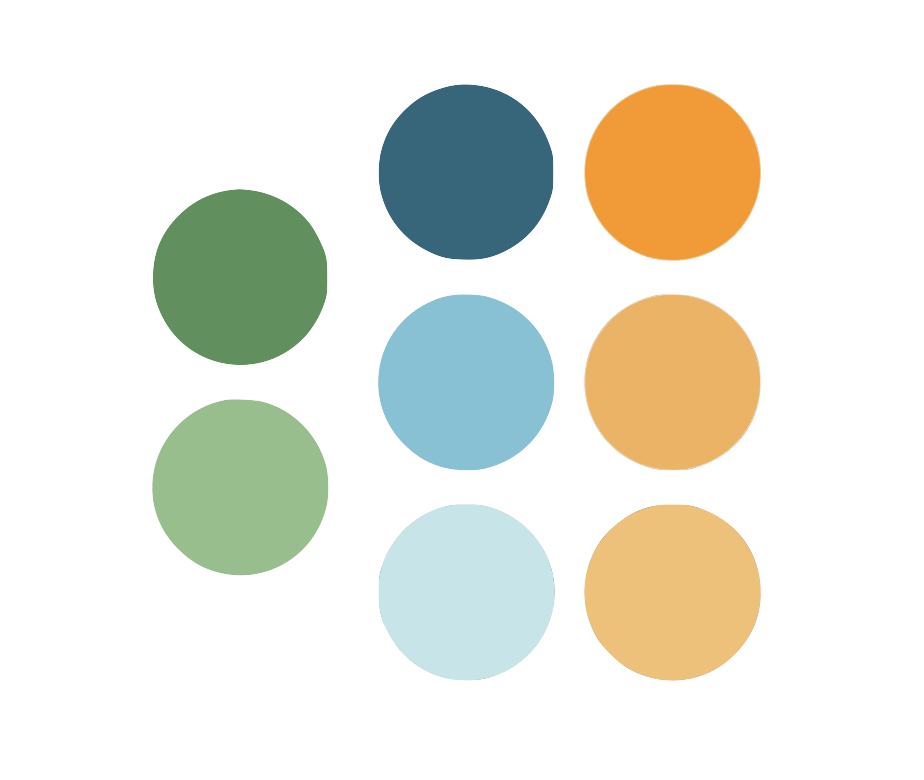
Color Pallet
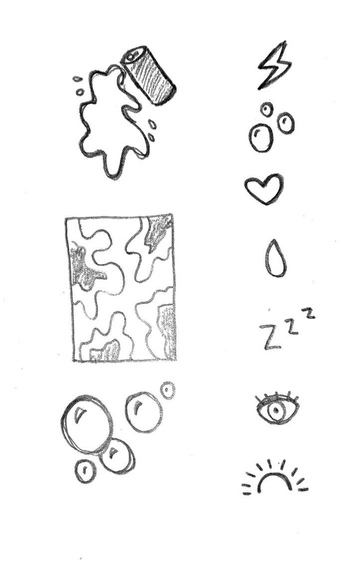
Icon Sketches

Layout Sketches
*
Layout Sketches *

Interactive Design
Poster Design


Click Here For Interactive Design!
—>

FINAL MOCKUPS


Project 2 : Remarkable Landmarks
Project Overview
For this project we had to select a special landmark and do research on the full story behind it and all of its history. In that research we needed to gather all data, statistics, dates, fun facts, location, height, etc. and compose those findings into visual graphic models. The point of this project was to combine multiple visuals and create a poster that is driven by data. Learning to transform data into visual aids is the main purpose for this assignment. I decided to create my poster based off of the famous ball drop in New York City on New Years Eve. I touched on the design changes throughout the years, a fun vertical timeline, and fun facts.


MOODBOARD
Color Palette and Type Choice
I wanted to go with pops of color as confetti but have my poster mainly dark grays and blacks. For type I chose a retro 60s font which reminded me of the first ball created for the ball drop.
Added Assets


FINAL POSTER
*
FINAL POSTER *


Project 3 : Data Selfie
Project 3 : Data Selfie
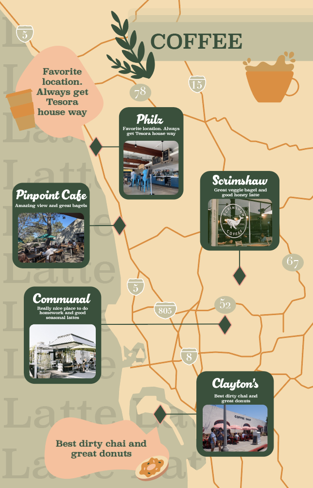
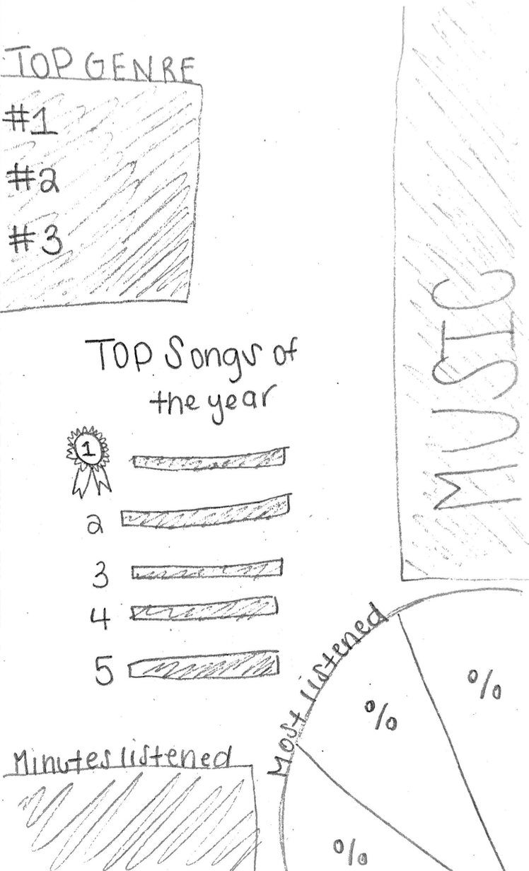
For this project we had to use Self-tracking data from our personal lives that make us who we are. We then had to create a data visual self portrait for three categories. This report is intended to include all of our information in a carefully crafted format that shows things like connections, context, and suggests correlations about who you are and what you like to do. My three topics were coffee in San Diego, Music, and dance team. I wanted to include specific date for music and dance team and then have my coffee poster as a map and guide to my favorite locations.


Data Gathered
Spotify Listens
22,096 Minutes Listened
Top 5 Artists (Dirty Heads, Sublime, Drake, SZA, Slightly Stoopid)
Top 3 Songs (Doses & Mimosas, The Sweet Escape, Funny Thing)
Genres
45% Reggae
35% Pop
15% Rap
5% Folk
Dance Team
Daily To Do List
Countdown Til’ Nationals (45 days)
Total Hour this semester: 480
Hours Per month graph
Coffee In San Diego
Philz Encinitas
Pin Point La Jolla
Scrimshaw
Communal Cafe
Claytons Cafe