Wild & Wholesome
Wild & Wholesome
This creative endeavor was designed to provide a comprehensive understanding of the packaging design process, from concept to completion. We were given detailed guidelines and a design brief to create a packaging solution tailored to a specific animal product, with the goal of developing a cohesive set of three products. A significant portion of the project focused on creating a strong, foundational logo.
In addition to the packaging design, I was tasked with creating deliverables, such as advertisements, stickers, and reusable bags. My design concept aimed to captivate attention with a playful yet sophisticated aesthetic. The design evokes a fun, animal-loving vibe while incorporating organic elements to reflect the sustainable nature of the product. I developed a packaging line for dog treats, targeting a range of dog sizes, from small to large. By varying the colors and imagery across the set.
Meet the Clients

Sara

Jake
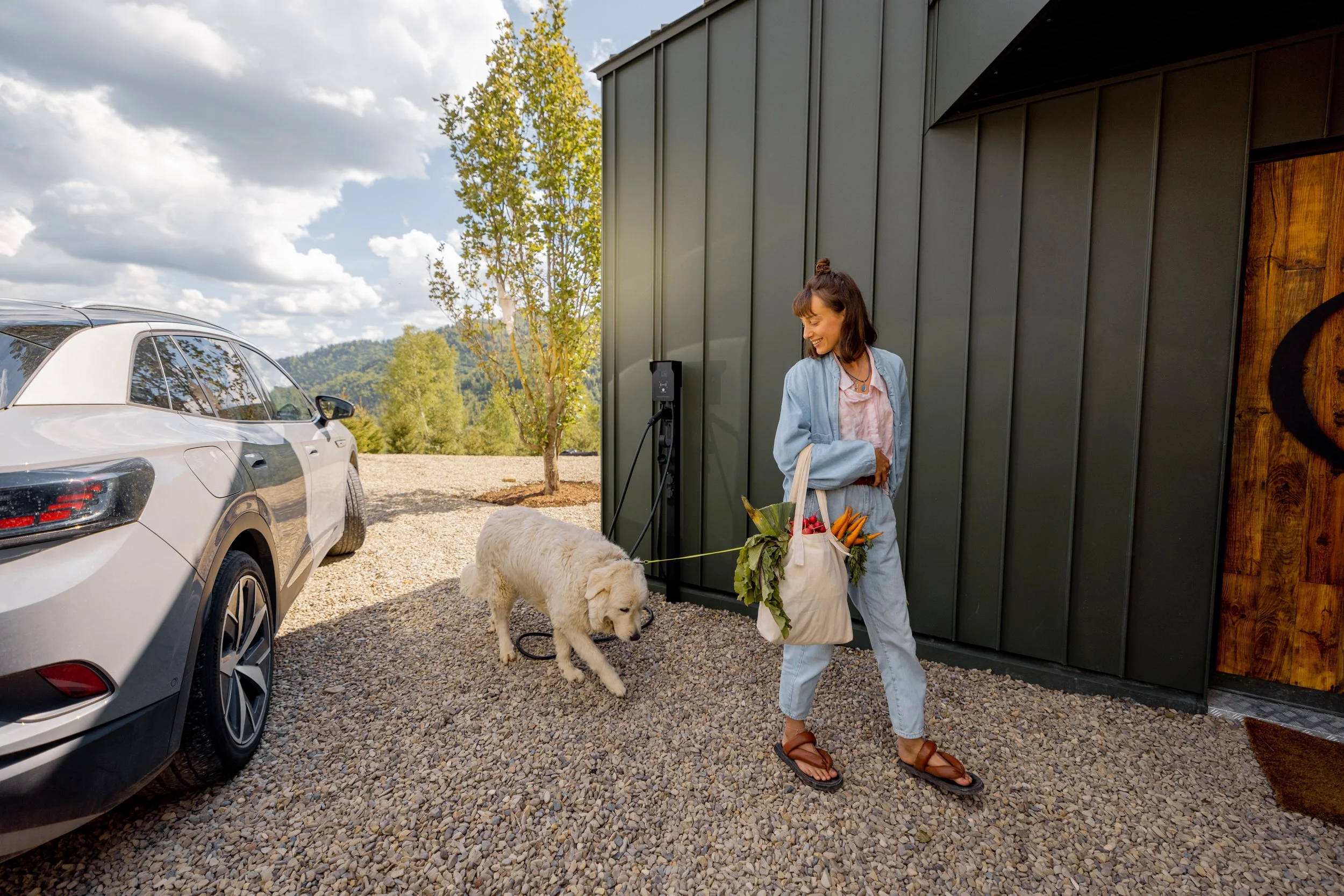
Wild and Wholesome is a locally owned pet store created by animal lovers, Sara and Jake. They both have thirty years of experience in the pet care industry and were ready to curate a brand that focuses on sustainable and organic pet products. They wanted to elevate pet care as a whole by using healthy and natural ingredients. They want the best for you and your pets and believe their brand does just that with their carefully curated products. You can count on them to always have healthy and environmentally friendly options that you can trust. Educating consumers on the benefits of healthier options and creating a friendly environment is their number one priority!
I wanted to stick earthy tones on the packaging to let the customer know they are organic and sustainable. A clean packaging look can always reference the clean and healthy ingredients on the inside so I wanted to go with a simple but effective design that pulls the eye in to read more. Friendliness is one of the most important traits that their brand represents.
Type Choice & Color Palette

Logo Process
Initial Sketches
Digital Roughs
Final Logo
Primary Packaging Design
Final Packaging


Click Here to View My Book!