SAN DIEGO SAUCERY
San Diego Saucery
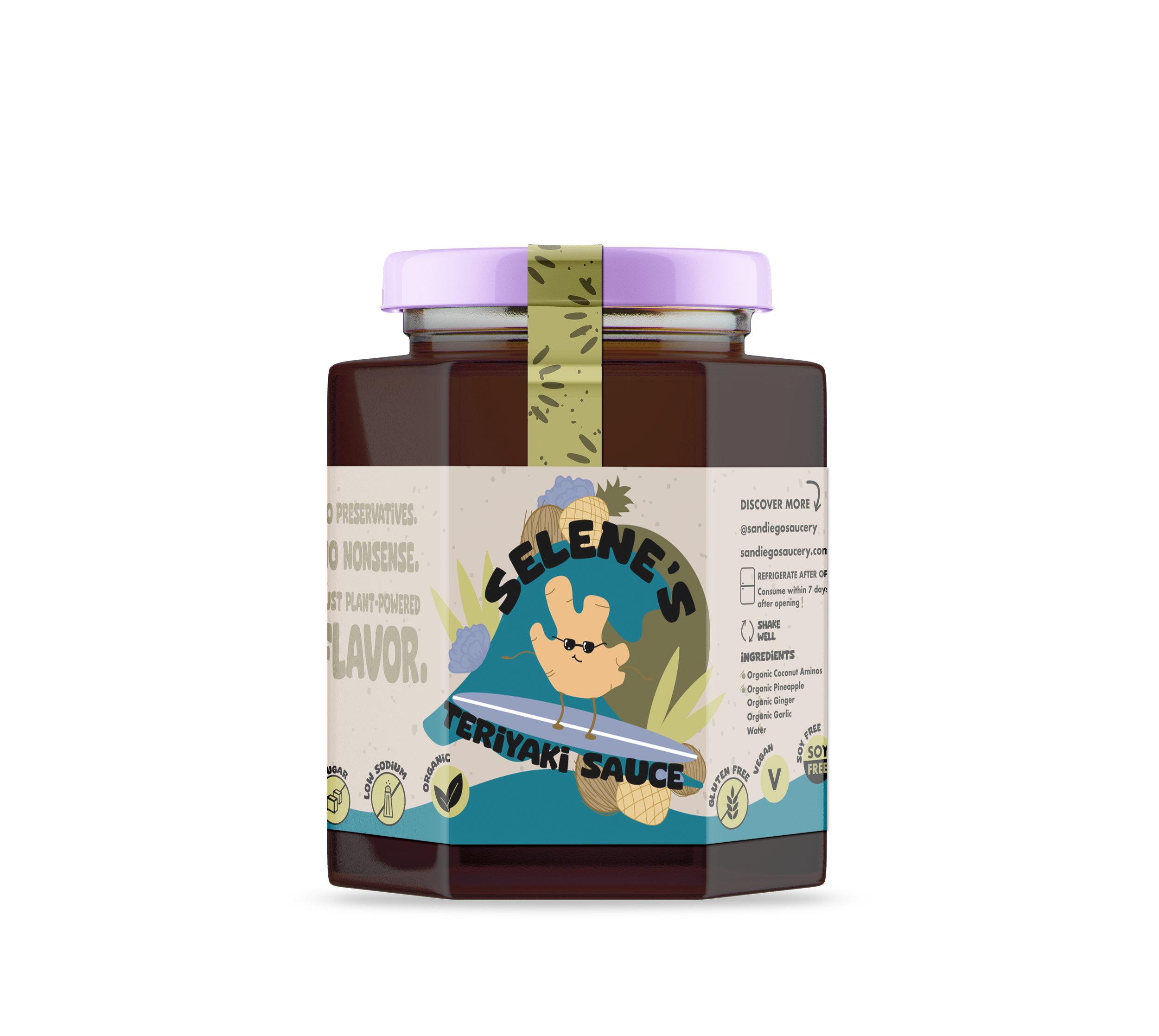
San Diego Saucery set out to expand its brand presence with a fresh packaging layout for its signature Teriyaki Sauce and new product, Sprinktop. In addition to the product packaging, we developed a new logo, stickers, business cards, and designed elements for the website to create a cohesive brand experience.
The primary goal was to capture the essence of San Diego’s vibrant, laid-back culture through fun, lively packaging and branding elements. We wanted the visuals to feel fresh, approachable, and reflective of the local lifestyle while making the sauces stand out on shelves.

MOODBOARD

For San Diego Saucery, I aimed to capture an authentic San Diego beach vibe while experimenting with fresh color palettes. I created a handmade font for the logo to bring a personal, laid-back feel that matched the client’s vision. I kept the color palette mostly neutral with pops of green to highlight the brand’s focus on health and fresh ingredients.
The typeface choice was key — it had to feel organic, approachable, and true to a beach-town aesthetic. I designed the logos to be simple but meaningful, clearly communicating the fun, fresh spirit of the brand without feeling overcomplicated.
LOGO PROCESS


PACKAGING LAYOUTS